Menu
-
-
FURNITURE
- SOFAS
- CHAIRS
- BENCHES & STOOLS
-
TABLES & DESKS
- BALUSTRADE TABLE™
- BARCLAY CONSOLE™
- BARCLAY CONSOLE™ - PETITE
- CHARIOT TABLE™
- GAME TABLE™
- LARGE OVAL NIGHT TABLE™
- SALADINO DESK™
- SQUARE DUPLEX TABLE / OTTOMAN™
- TERRAZZO TABLE™
- THREE-LEGGED COFFEE TABLE™
- TRIPOD COCKTAIL TABLE™
- TRIPOD END TABLE™
- TRIPOD PULL-UP TABLE™
- TRIPOD SIDE TABLE™
- XXX BREAKFAST TABLE™
- XXX DINING TABLE™
- OTTOMANS
- LIGHTING
- EXTRAS
-
SHOP NOW
-
COMPANY
- QUOTE
- CONTACT
-
- (212)-684-6805
- Login

Add description, images, menus and links to your mega menu
A column with no settings can be used as a spacer
Link to your collections, sales and even external links
Add up to five columns
Add description, images, menus and links to your mega menu
A column with no settings can be used as a spacer
Link to your collections, sales and even external links
Add up to five columns

SIGNATURE HOMES: A NEW YORK VITRINE
October 20, 2022 3 min read
This apartment was bought as a pied-a-terre by a couple who had social and business interests in New York City. Like so many apartments that are not the occupants’ chief residence, the second bedroom had to do triple duty – as a room for the couples’ young children when they were in the city, for occasional guests, and as he home office. The initial appeal of this otherwise featureless flat was its floor-to-ceiling glass windows with their staggering views of Central Park. So my aim was to transform a series of boxes in a single drawer of what I call “a filing cabinet for the living” into backgrounds that were equal to the view.

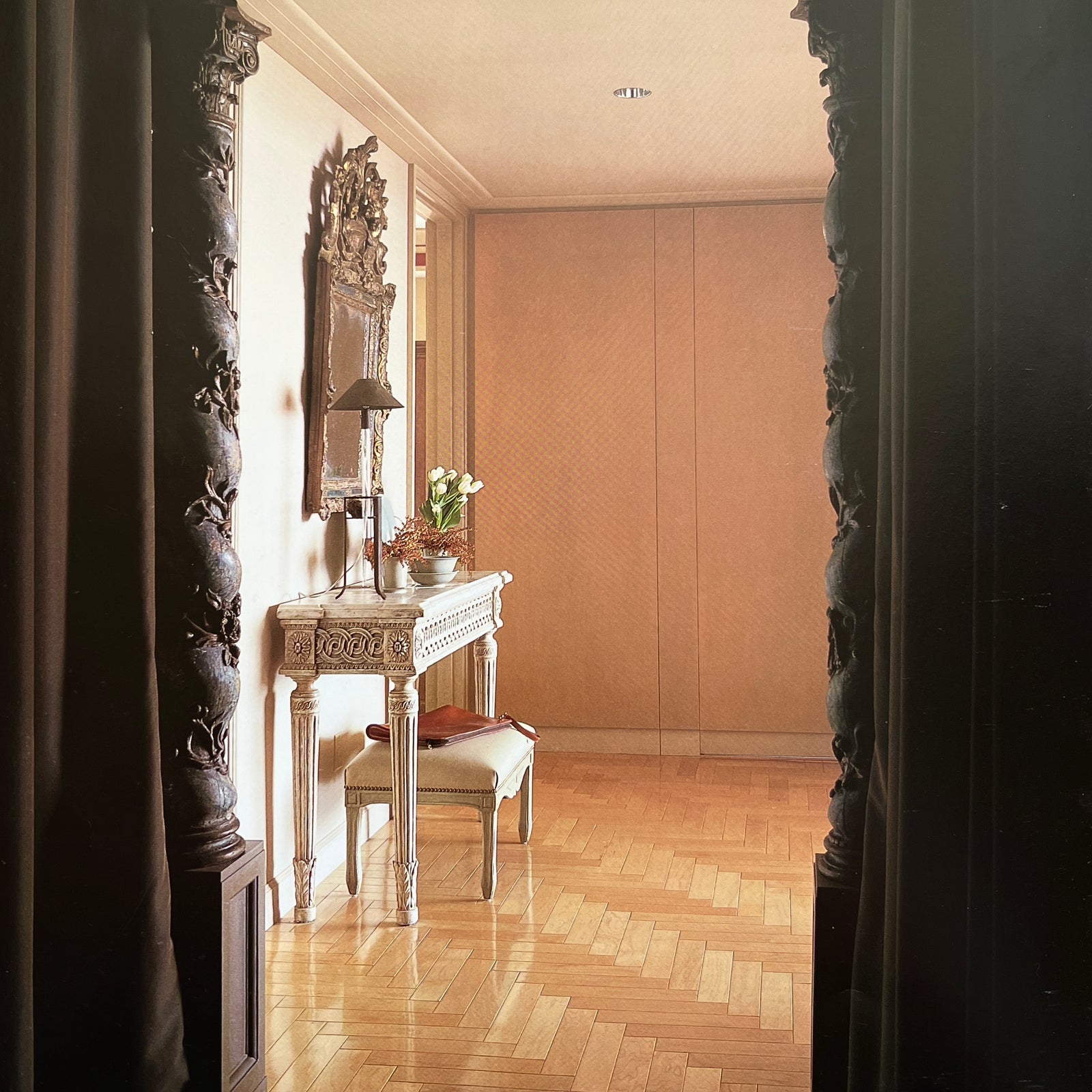
By moving walls and concealing doors, I made a large L-shaped living room that makes the best use of a corner with two walls of glass. To fully exploit the effect of this light-filled space, I hung the entrance of the foyer with murky, teal-colored fabric to create a softly enveloping tunnel (and hide unattractive closet doors). This enclosure causes visitors to pause, subliminally wiping their visual slates clean, and propels them towards the light ahead. Once they are released into that space, they perceive it as larger and lighter by comparison with the small, dark entrance.

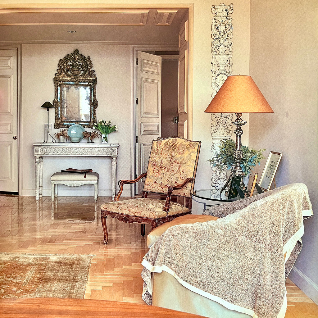
Looking back form the windows in the living room shows how the focal point, the ruined eighteenth-century French mirror, has been emphasized both by the flanking doors and by the paneled archway. The vertical ornament, an antique piece of forged iron fretwork, on the wall to the right has been placed there to balance the narrower width of the wall opposite. The soft, linen-covered walls and exaggerated cornice temper the severity of the modern proportions of the rooms, while the sofa is upholstered in the same fabric as the walls in order to maximize the feeling of space. The folding screen conceals a large television set and also helps to give a more intimate, cozy feeling to this end of the room. Here you could retreat and curl up with a book away from the sometimes overpoweringly dazzling view.

The substantial, weight-bearing support in the corner of the living room has been visually dissolved by cladding it with mirrors and continuing the woodwork of the windows to the right and left of it. A third wall to the left is also mirrored and the same molding used again, to replicate the effect of real windows. The result makes visitor believe that they are seated in the middle of a vitrine with uninterrupted, 180-degree views. The large crown molding conceals sources of soft lighting so there are no lamps to create disturbing reflections in the windows after dark. The carpet organizes the conversation area and separates it from the dining space.

The twin beds in the second bedroom are furnished as sofas in the daytime so that the space can be used as an office. The deep red accents – the color of old, handmade bricks – were used to give the room an atmosphere that would appeal to the young children who use it on the occasions when they are in New York.
The doors, which, like all the doors in the apartment, were standard flat metal plates, have been disguised by classical molding and paintwork.

The queen-size bed in the master bedroom was custom-designed to stand high above the floor. This creates the illusion of more space because it allows a greater area of carpet to be visible than a traditional bed which, with its skirting to the ground, would have seemed to fill up the narrow room. The armoire opposite the bed was also custom-designed: the top conceals uplighting, the doors slide back into the pockets to reveal the television, and the drawers below provide much-needed storage. In order not to shroud the effect of the vitrine, heavy drapes have been banished in favor of light blinds.

Subscribe
Sign up to get the latest on sales, new releases and more …

WELCOME!
Stay in touch for all the latest from the world of Saladino