
(The dining room at Robin Hill is a symphony of shimmering, cool colors in the summer. The glossy celadon woodwork, antique white Marseilles tablecloth and blue-white chintz slipcovers, and especially the gossamer-fine spun-fiberglass roman blinds, mounted in eighteenth-century style, gently reflect the color of the pale amethyst walls. In winter the slipcovers are removed to reveal the light taupe wool upholstery, bringing seasonal warmth to the room.)
When I first ventured into the dome area of the townhouse that would belong to Sir John Soane, the last great Georgian architect of England, I was overcome by what I saw: it is a catacomb, over two stories of excessive collecting. His plunder from the ancient Mediterranean world – statues, busts, and urns, fragments of columns, sections of friezes, finials, and plaques, capitals and corbels of every size and shape – is calculatingly hung from the walls, or pieces are stacked on top of each other like so many totem poles. Lit by a large domed skylight, the color of the stone and marble vary every hour of the day, and with every flicker in the weather. The cumulative effect is of an abstract interior, and envelope enclosing endless variations of one overall, elusive color. It reminded me of the scheme John Fowler used when he was asked to restore the entrance hall at Syon House in the 1960s. These subtle nuances of color make a deeply satisfying harmony.

(The dome area of Sir John Soane's house in London is almost exactly as he left it when he bequeathed it to the British nation as a museum in 1833. His collection of Greek, Roman, and Egyptian antiques is arranged not by periods or cultures, but as a sumptuous collage, and the first impression it gives is of a kaleidoscope of shades and tones of cream, clay, taupe, and gray.)
Although the central hall of mirrors in the Amalienburg outside Munich is so different in every respect from the Soane house, the essence of its appeal to me is in the cumulative, shimmering effect that cannot be pinned down to just one or two colors. This room, the epitome of eighteenth-century Rocococ style, is elegant, mirrored, and layered in many tones of pale blue, cream, and silver leaf. The reflections and pale hues create an ethereal interior landscape that I longed to emulate as soon as I saw it.
Color palates that you have seen and liked are a good starting point, but need not be duplicated exactly. Use the overall effect of the original to create your own schemes. The Amalienburg was the inspiration for the color scheme in my dining room at Robin Hill. The walls are pale amethyst, and the woodwork is finished in a high-gloss celadon. Bleached floors, shiny platinum-colored chintz tablecloth, and blue-white slipcovers create a cool oasis that is an echo of the icy sparkle of the German palace that inspired it.

(The sitting room at Robin Hill is a winter room, so I used flat paint on the vaulted ceiling and walls. The color, however, is metamorphic: it changes with the light, from cinnabar-red to dusty rose, or brown. When I stripped the 1930s green paint off the antique American paneling, I left all existing traces of the original 1680s surface. At that time it would have been painted in faux-marble to resemble the costly chimney breasts of England.)
The colors I like best are those that change constantly with the light, and that do not reveal themselves immediately. These are the colors that are sensual to me, as intimate as someone’s touch. I have always been intrigued with colors that make you wonder “Is that celadon or is that gray? Is that beige or is that taupe?” And I love the chameleon colors that vary with the time of day and, when seen under the artificial light at night, become either richer and deeper, or seem to disappear completely. These are the colors that I call nuanced or metaphoric.
The most subtle nuanced color should have a luminous quality, like the frescoed walls of Italian palaces where the color is mixed into the wet plaster. The best way to achieve this effect is, if your budget permits, is to have the walls lacquered. A less expensive way is to have them coated with a thin layer of new plaster, and then, once they have been painted the color you want, finished with a coat of polyurethane. The latter technique is best reserved for deeper, warmer colors because the polyurethane will first darken the color and then, as it oxidizes in the light, will eventually turn yellowish.

(These colors evoke the pellucid light and aqueous shadows of a misty day in Venice.)
We are often more objective and adventurous about color in our dress than in our homes because our clothes can so easily be taken off and changed. However, in a certain sense, it is possible and very useful to “try on” room colors. Spend a small amount of money, buy a few quarts of paint, and color a corner. Look at that area when you wake up in the morning, and in the evening when the lights are on in the room. Live with the color for a month before going ahead and painting the whole room. We commonly test a roll of wallpaper – why not do the same with paint?
Relying on paint chips is unsatisfactory. Color multiplies in intensity when the square footage increases. What appears an acceptable color on a small chip can be very aggressive when enlarged. It is often wiser not to leap to what seems, at first, like an obvious choice. Rather than settling immediately for the color that you think you want, my advice would be to select a color a few shades lighter; that way the color of the finished painted space will often have the effect that you thought you would get from the small sample.
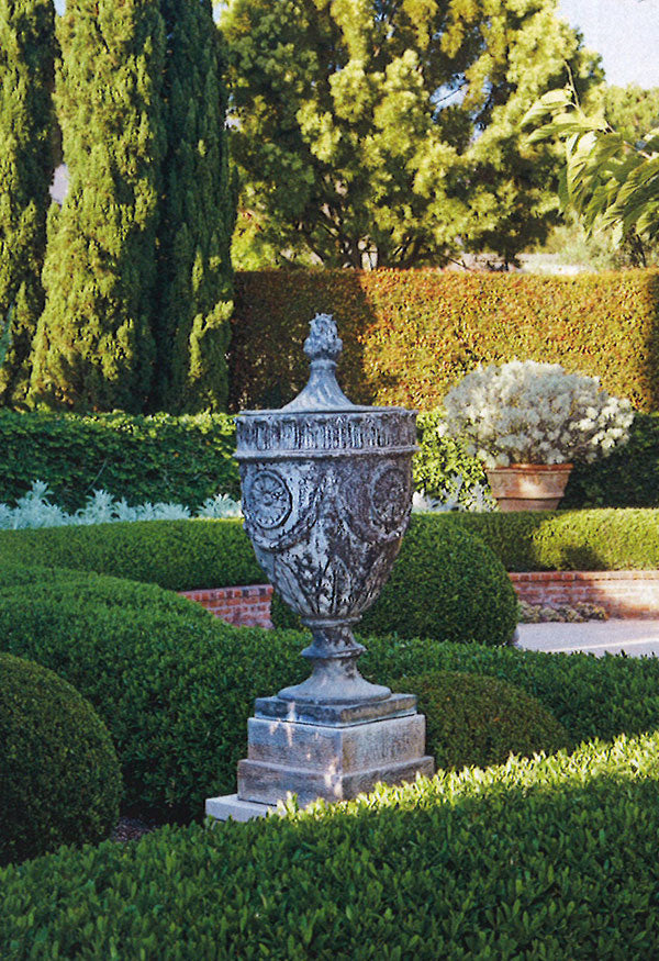
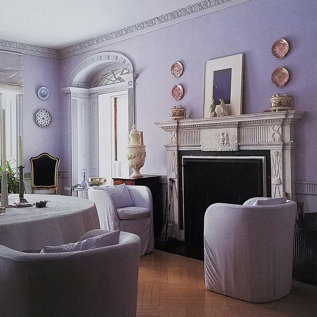
Some colors should only be used in a limit quantity. Shocking fuchsia on a soft pillow can be wonderful, but I cannot imagine using it to cover a whole sofa. On the other hand, metamorphic pale pinks and amethysts, both of which flatter a variety of skin tones, can be used more widely. Although most people avoid amethyst when decorating – they think of it as lavender and run in the other direction, it is one of my favorite colors.

(Bronze silk velvet and pale amethyst silk are muted enough to cover a sofa and chair.)
When colors are repeated they can act like a unifying musical theme, linking the rooms of a house. Using a background of muted, related colors is one way of doing this, and works especially well in rooms that lead into each other. Repeating accent color is another way of linking spaces.
Color can be used to highlight or play down objects, and to manipulate space in subtle ways. Seen against a background of pale, almost monochrome tones, antiques or period-style furniture will be set off and highlighted like pieces of sculpture. To reinforce a sense of space, the major piece of furniture should be the same color as either the walls or the floor. For example, a white refrigerator will recede into a white room, but in a dark blue room will stand out like a bandaged toe on a bride.